TouchTunes
In 2015, we were approached to support the renovation of the offices of a company that specializes in technological music products for bars and large businesses.
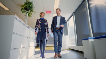
More recently, following the addition of a new product to their business offering — Apple for Business — TouchTunes contacted us to support the expansion of their offices. The mandate was to deploy the company’s brand image throughout the new spaces while also creating a visual and physical link between the now two-level space. The work environments needed to reflect the work of the employees and their passion for everything music related.
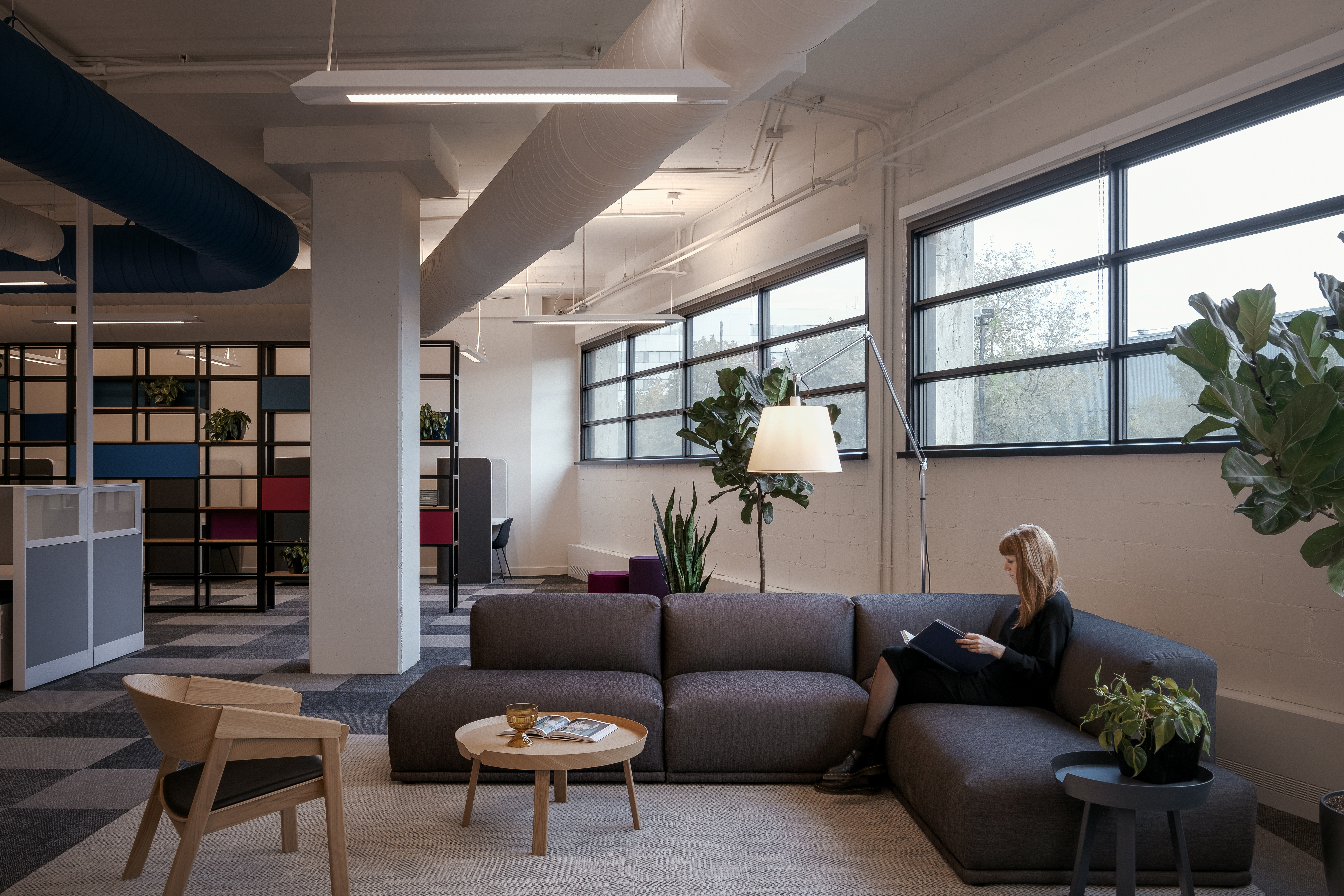
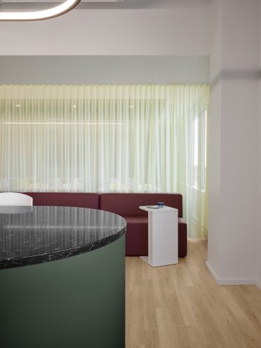
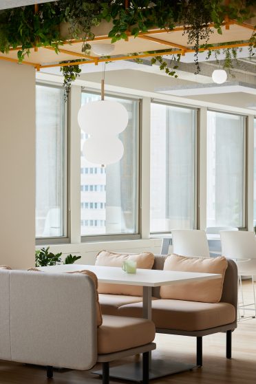
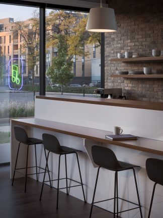
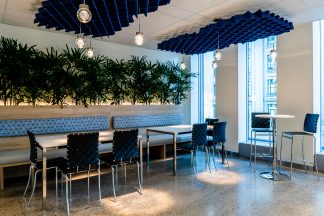
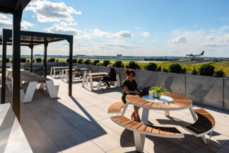
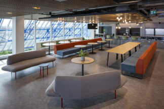
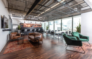
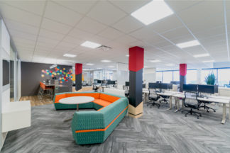
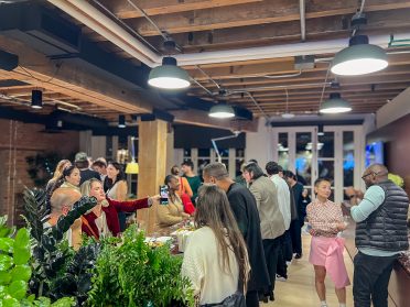
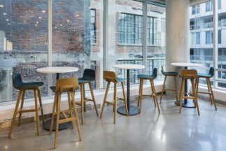
To create versatile spaces that stimulate creativity, we set up a middle-ground area between the cafeteria and main open space office plan with booths and tables. These booths serve equally as spillover for the cafeteria and informal meetings between employees. To support this purpose, the back wall of each booth was equipped with an erasable whiteboard so employees could jot down ideas while doing collaborative work with colleagues. In the same vein, an outdoor terrace was installed near the cafeteria. Located at street level and equipped with picnic tables, the terrace can serve as a workspace or even concerts, for instance. The result is a rallying space that’s flexible and inviting, and that dynamizes the building, but also the surrounding neighborhood.
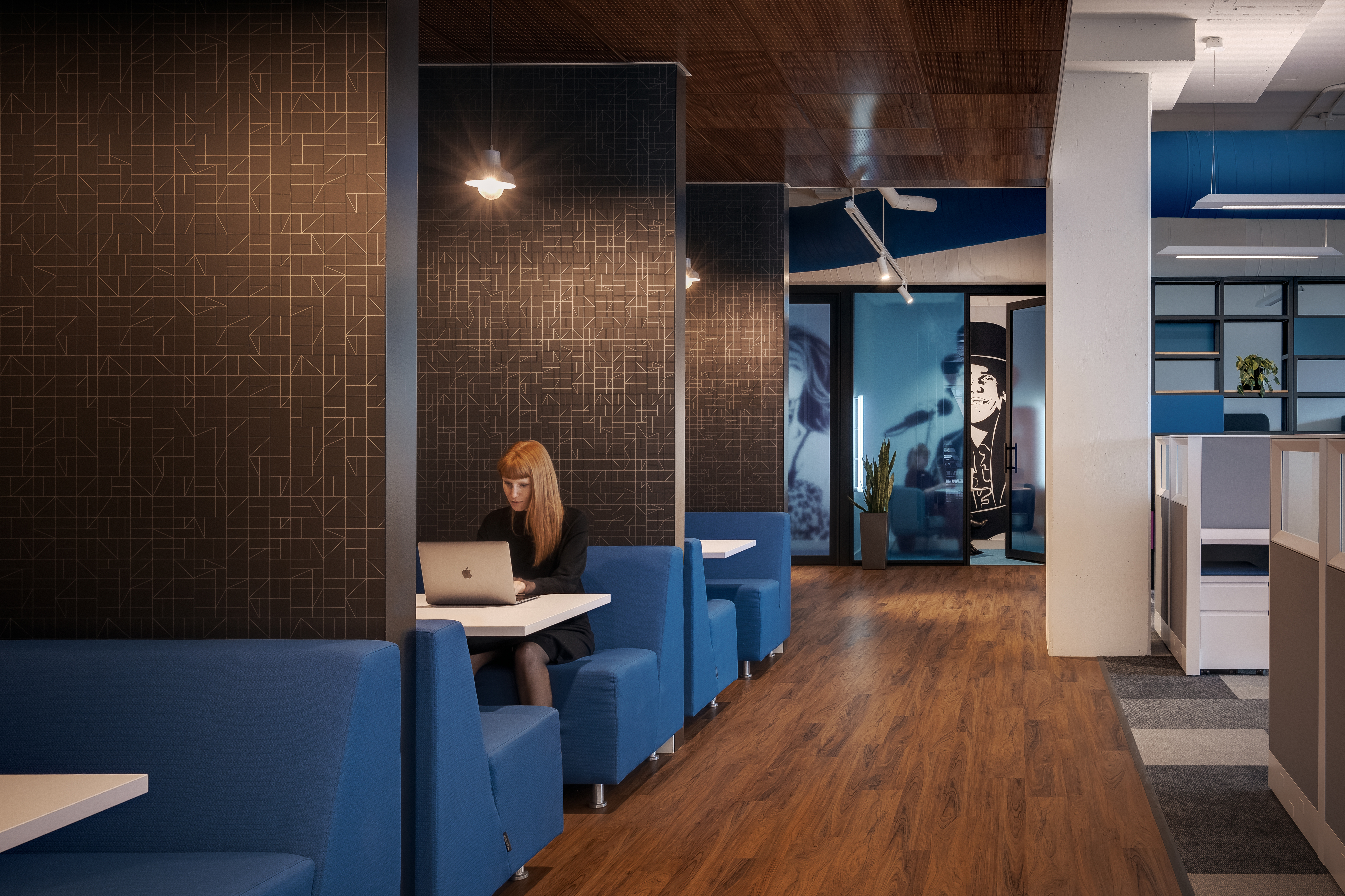
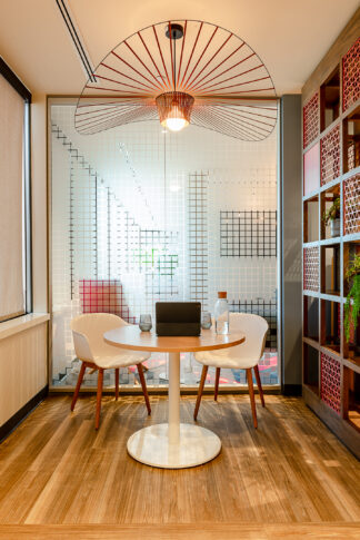
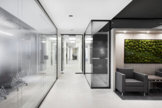
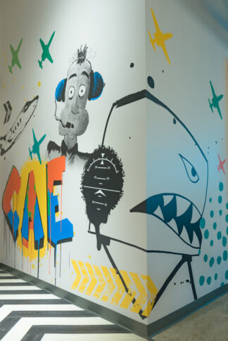
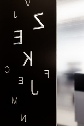
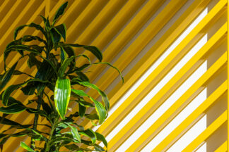
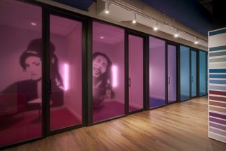
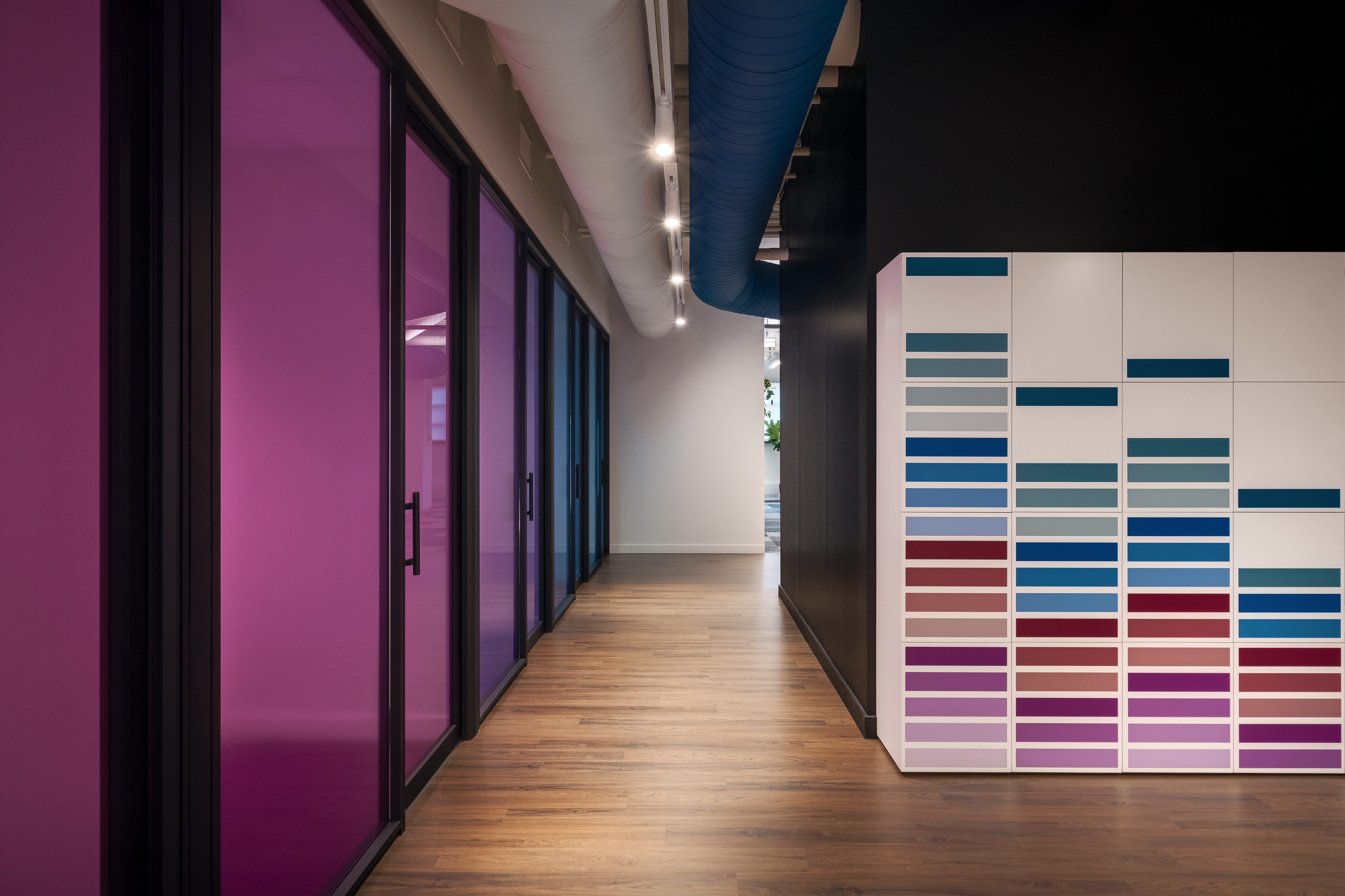
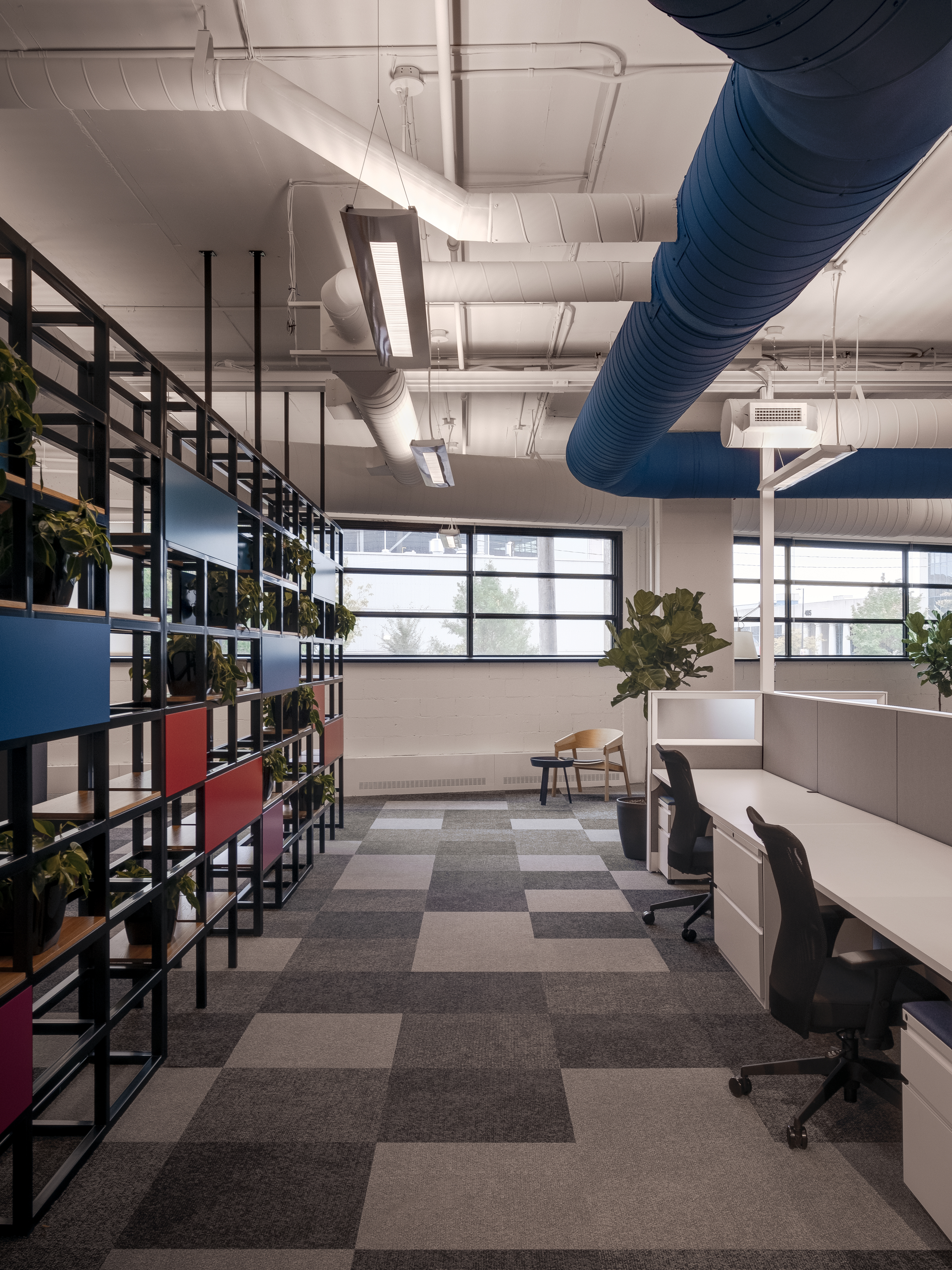
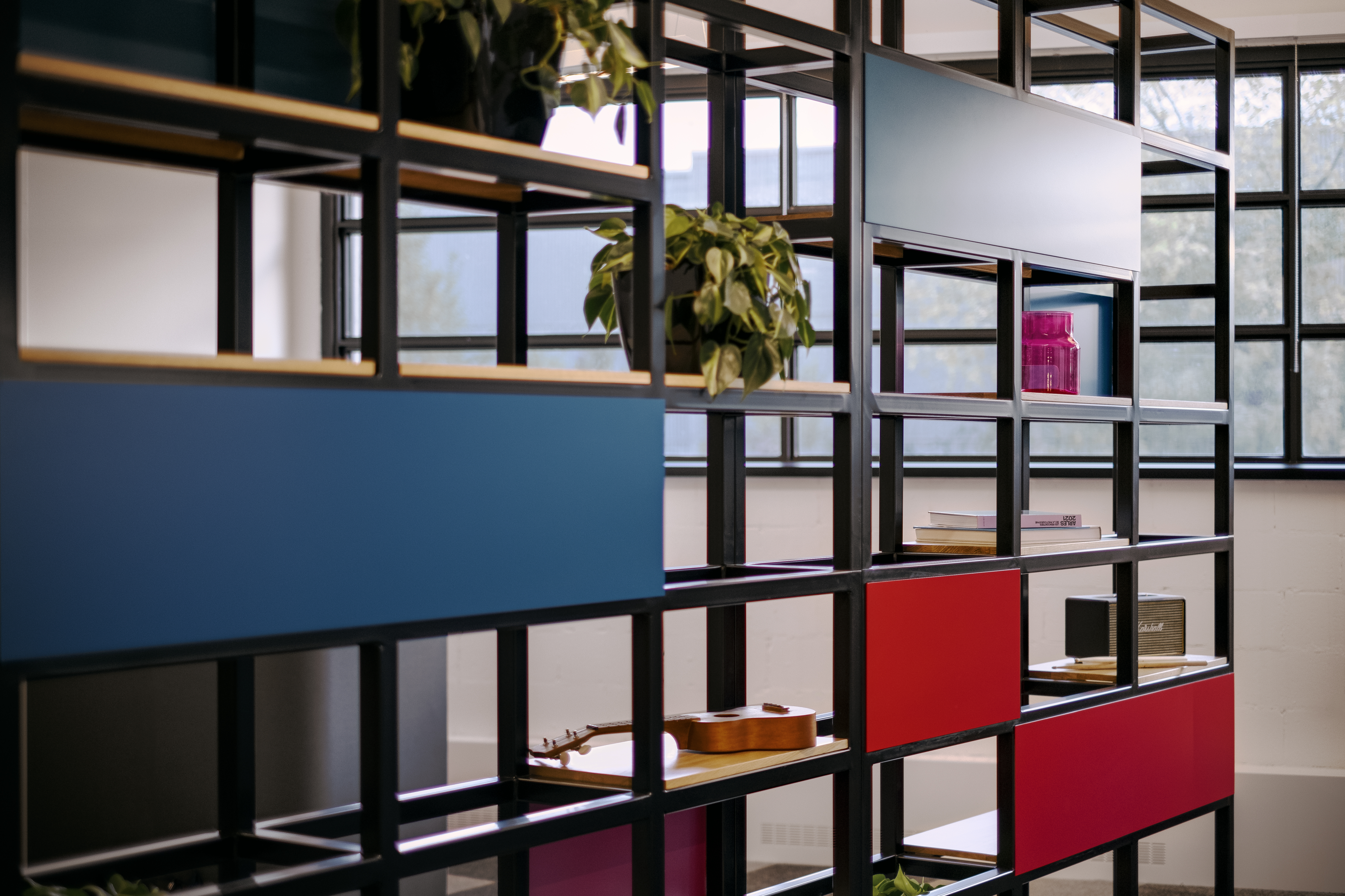
To create a quieter zone in the mostly open plan area of the office, we created a division wall that’s both aesthetically pleasing and useful. The wall, the design of which replicated the visual motif of an equalizer — another nod to the company’s musical culture — can be furnished with plants and music artefacts: records, books, speakers, etc. Other more silent zones in the form of phone booths were also included in the office design. Through the use of coloured films in the glass partitions of the phone booths, which create a gradient of colours as one walks down the hallway, as well as murals that depict various artists, one per room (Lady Gaga, Notorious B.I.G., Amy Winehouse, etc.), we created a visual code that distinguished the phone booths from each other.
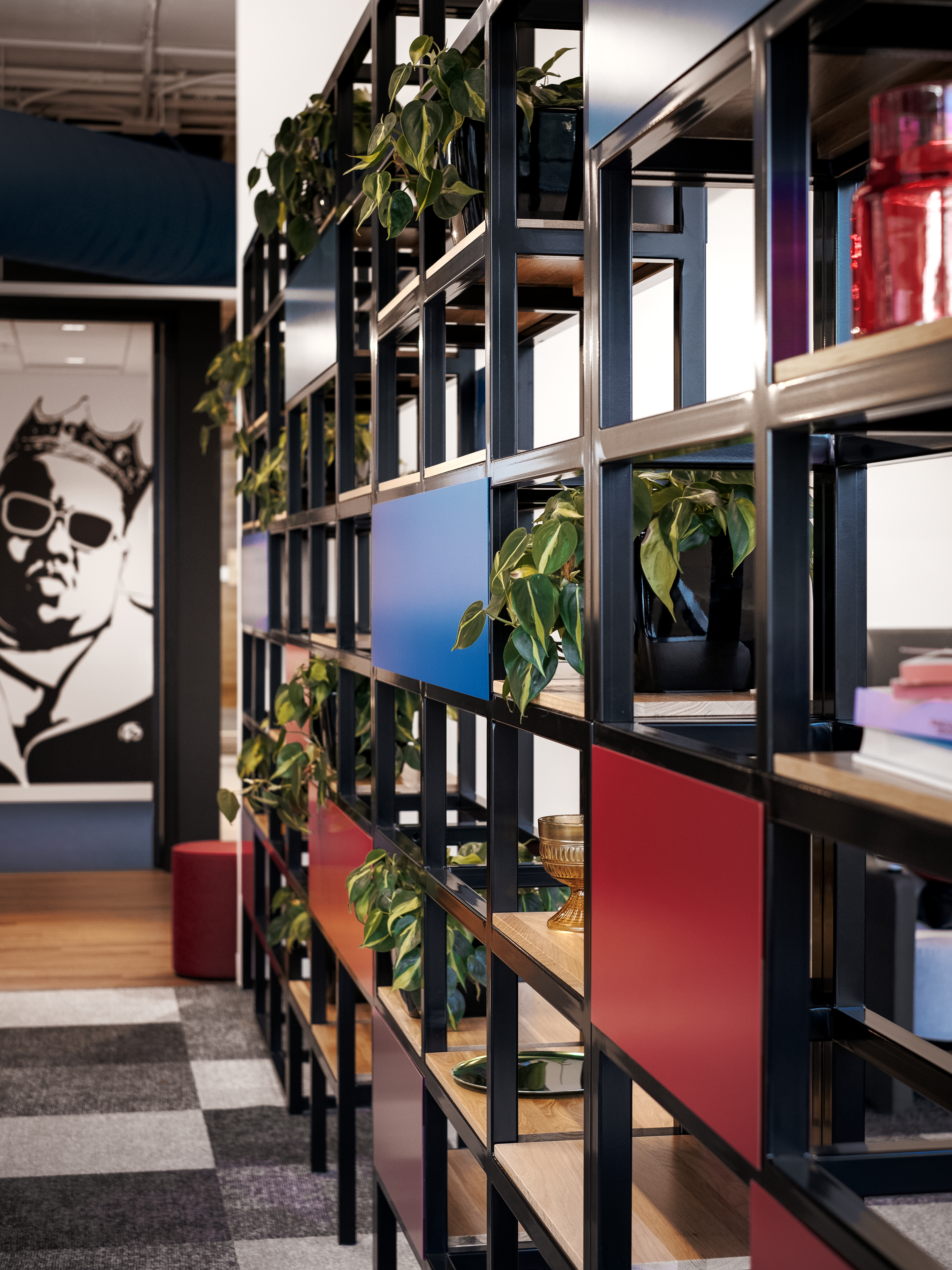
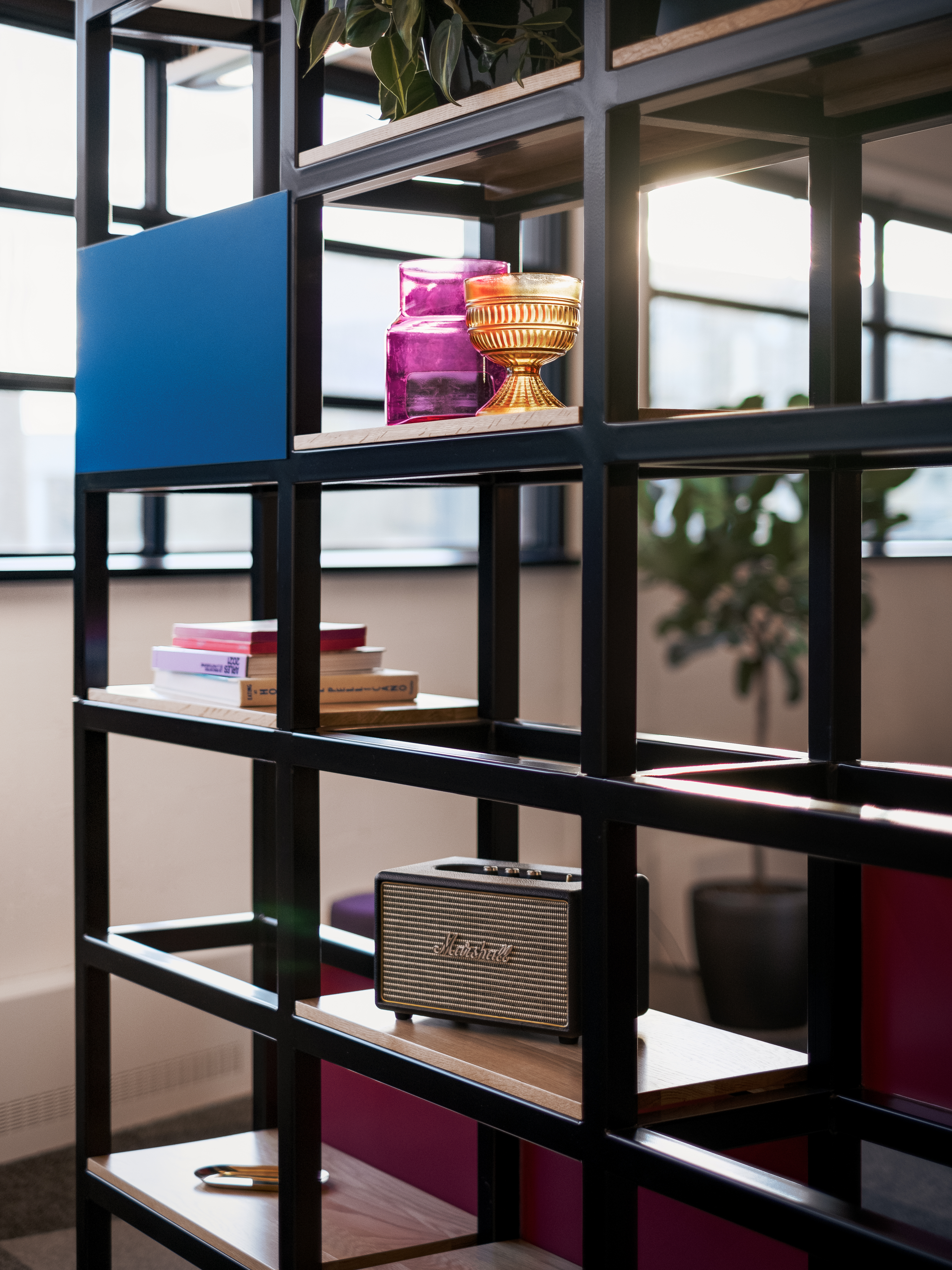
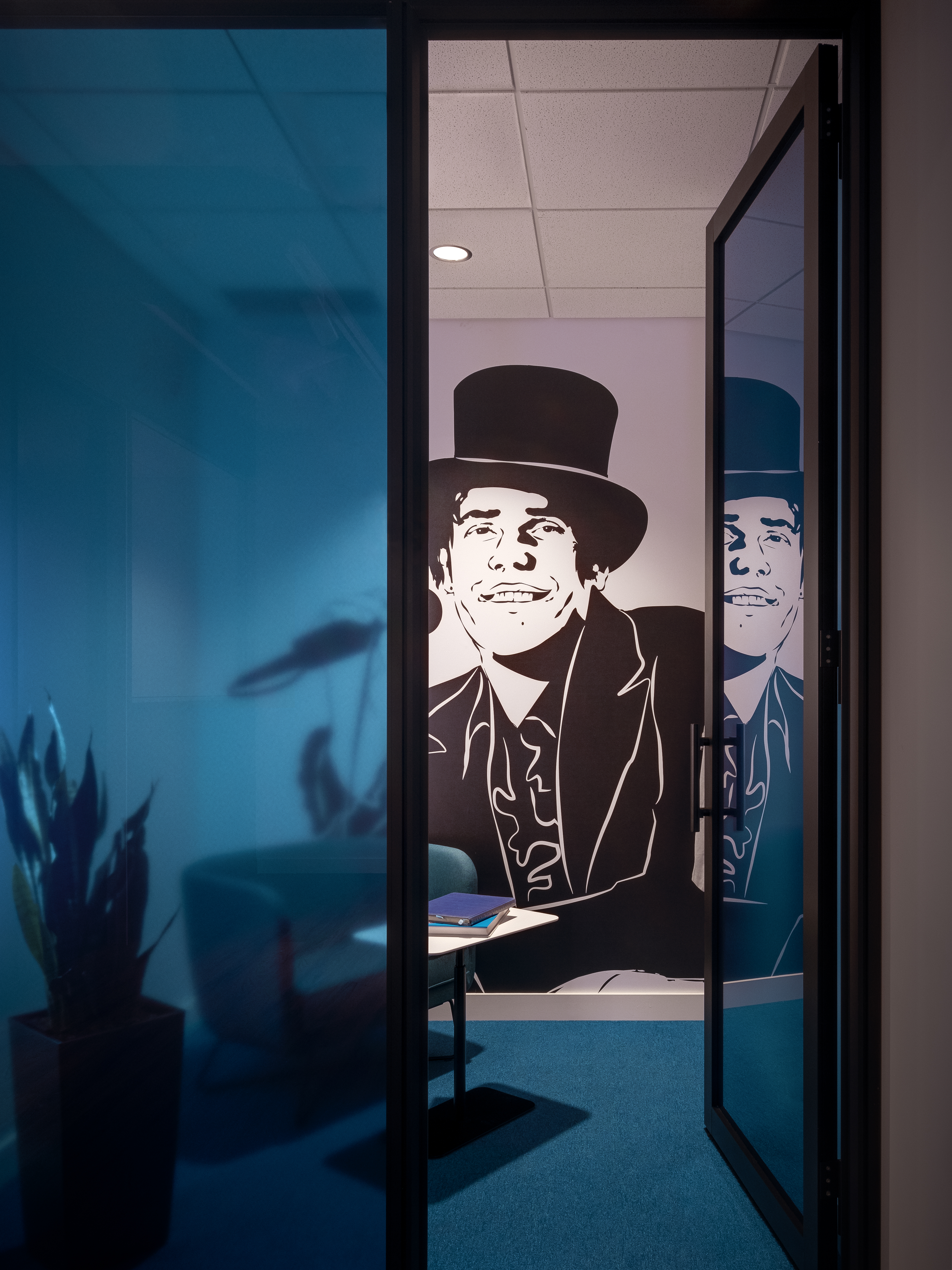
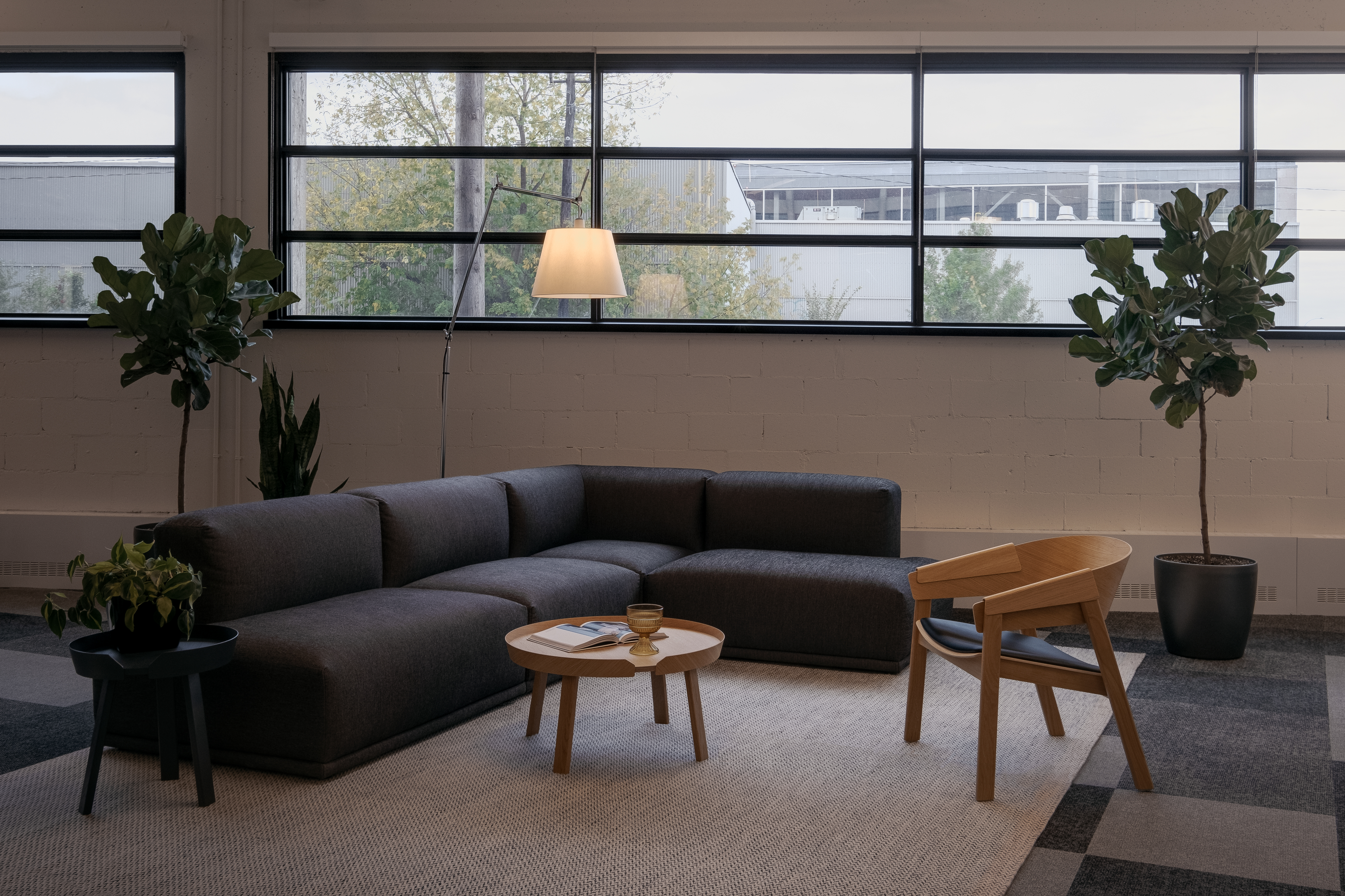
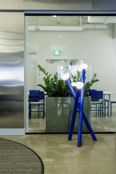
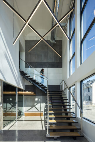
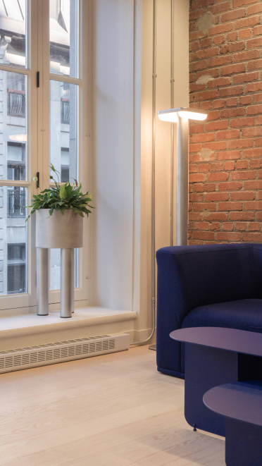
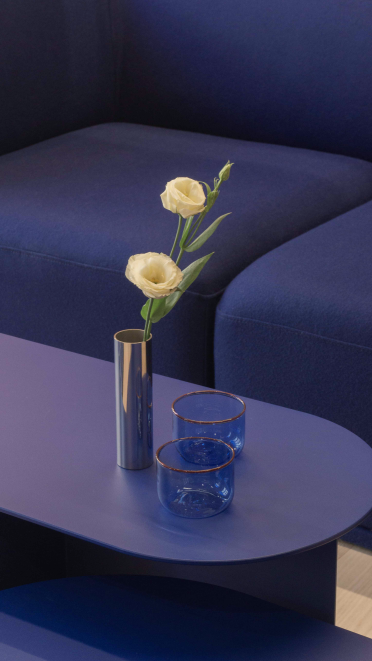
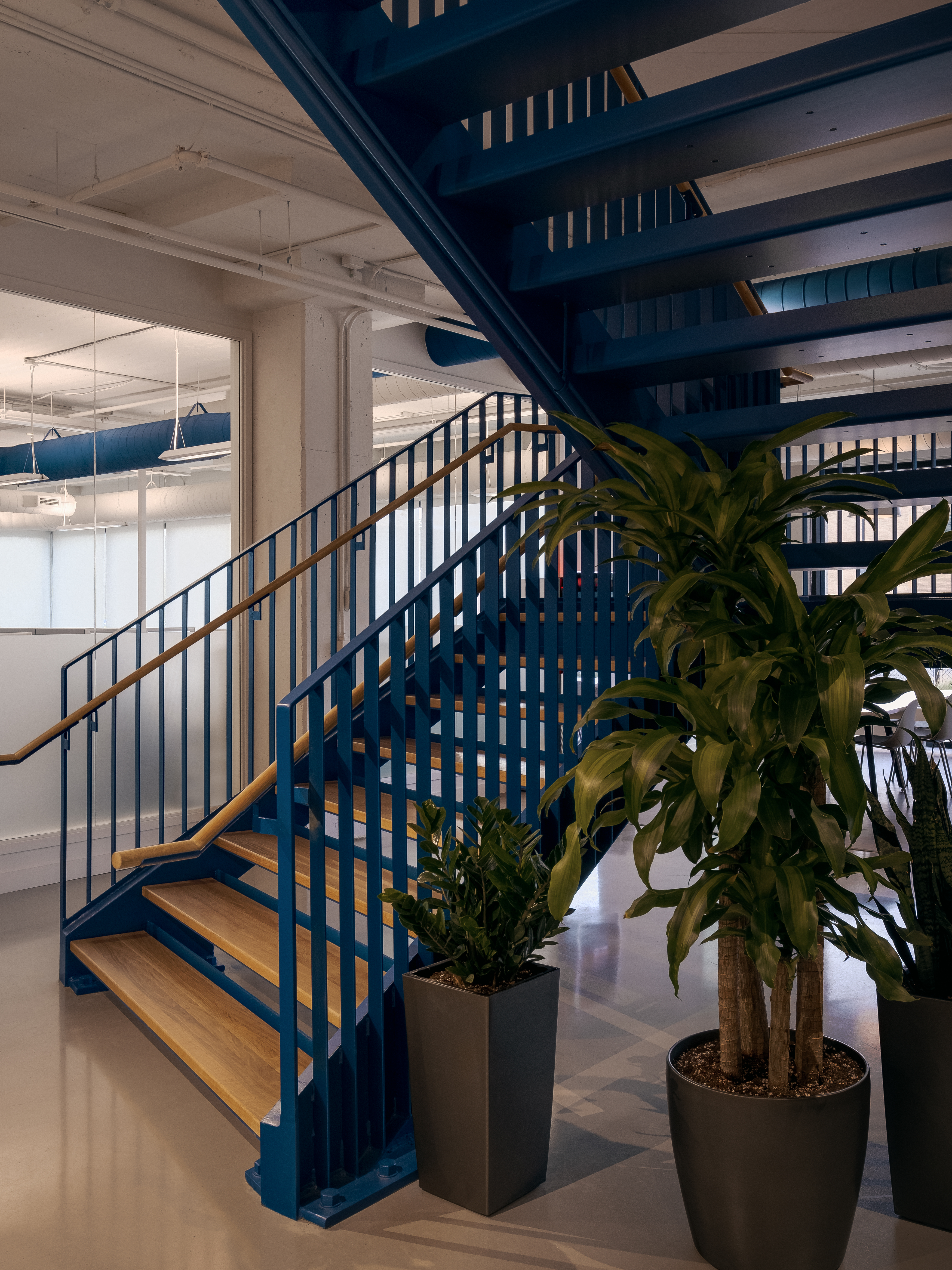
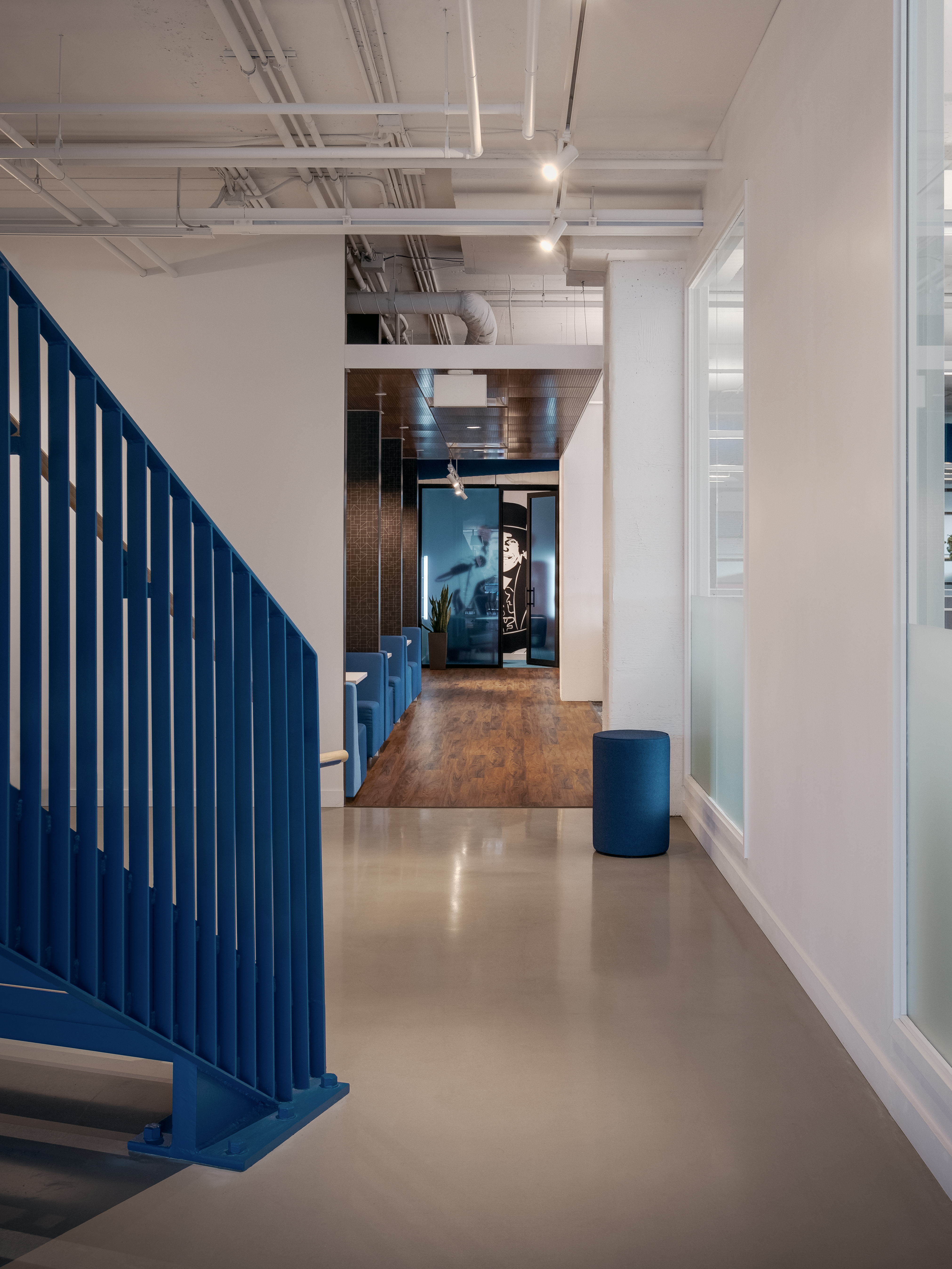
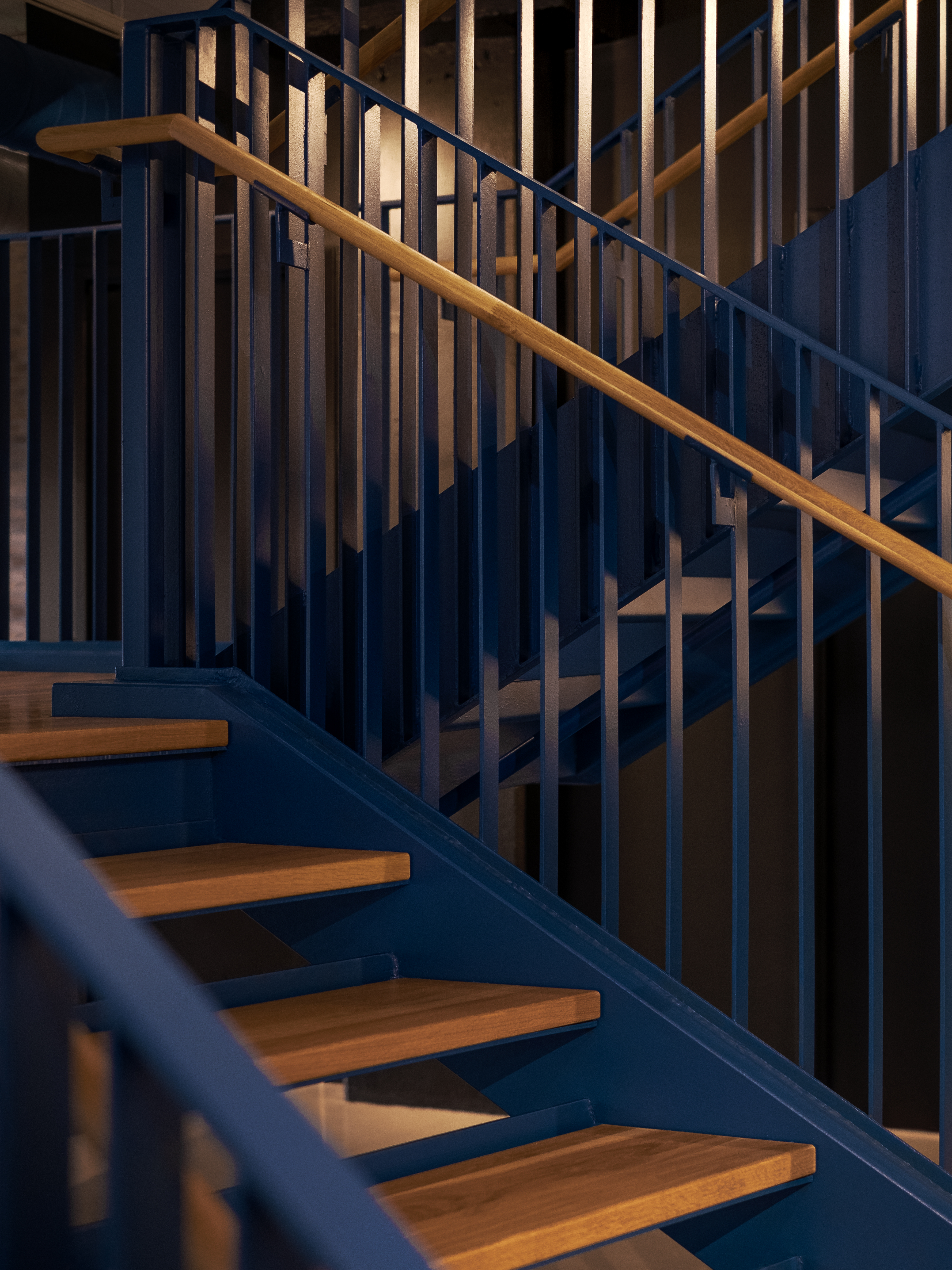
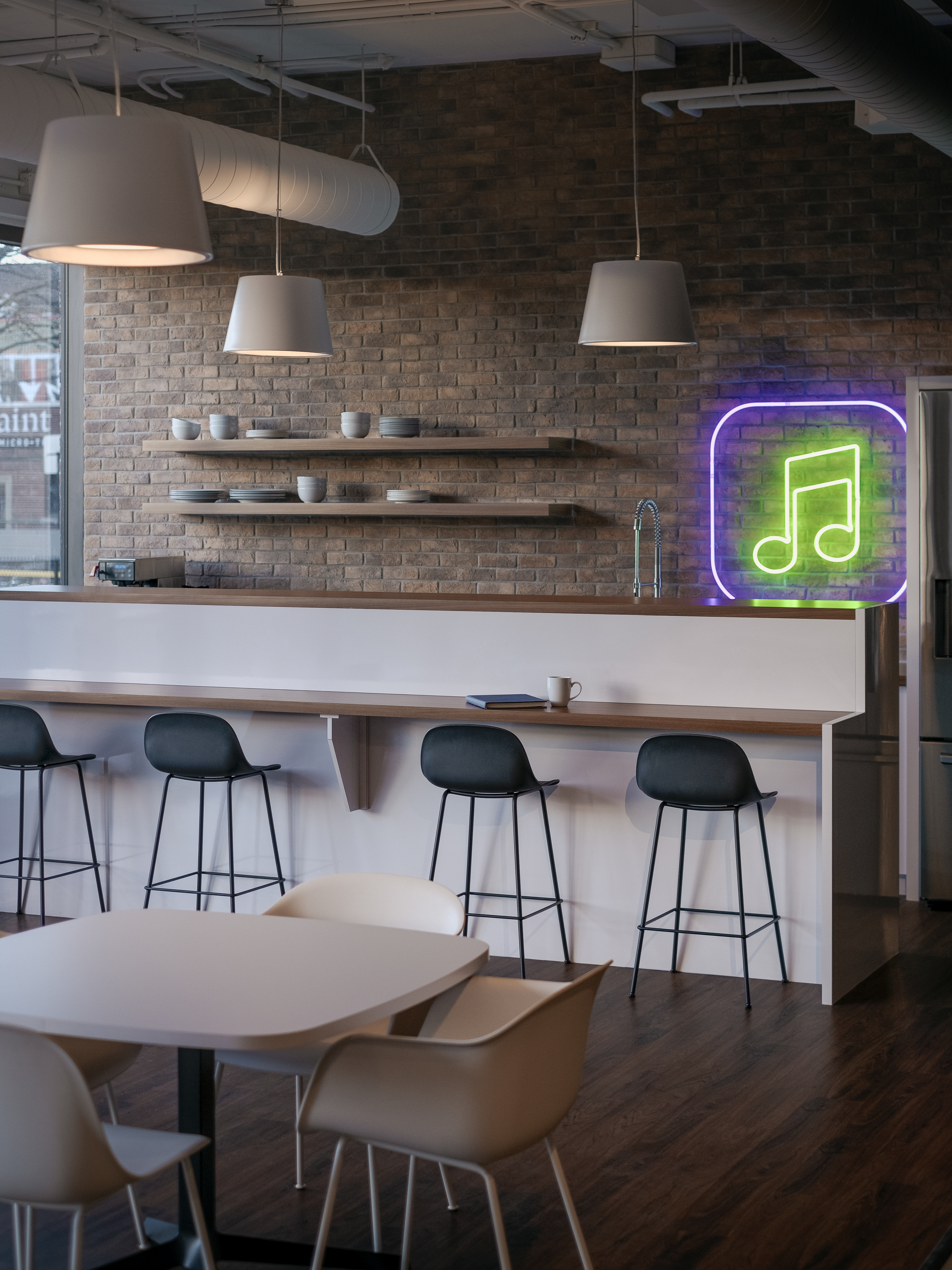
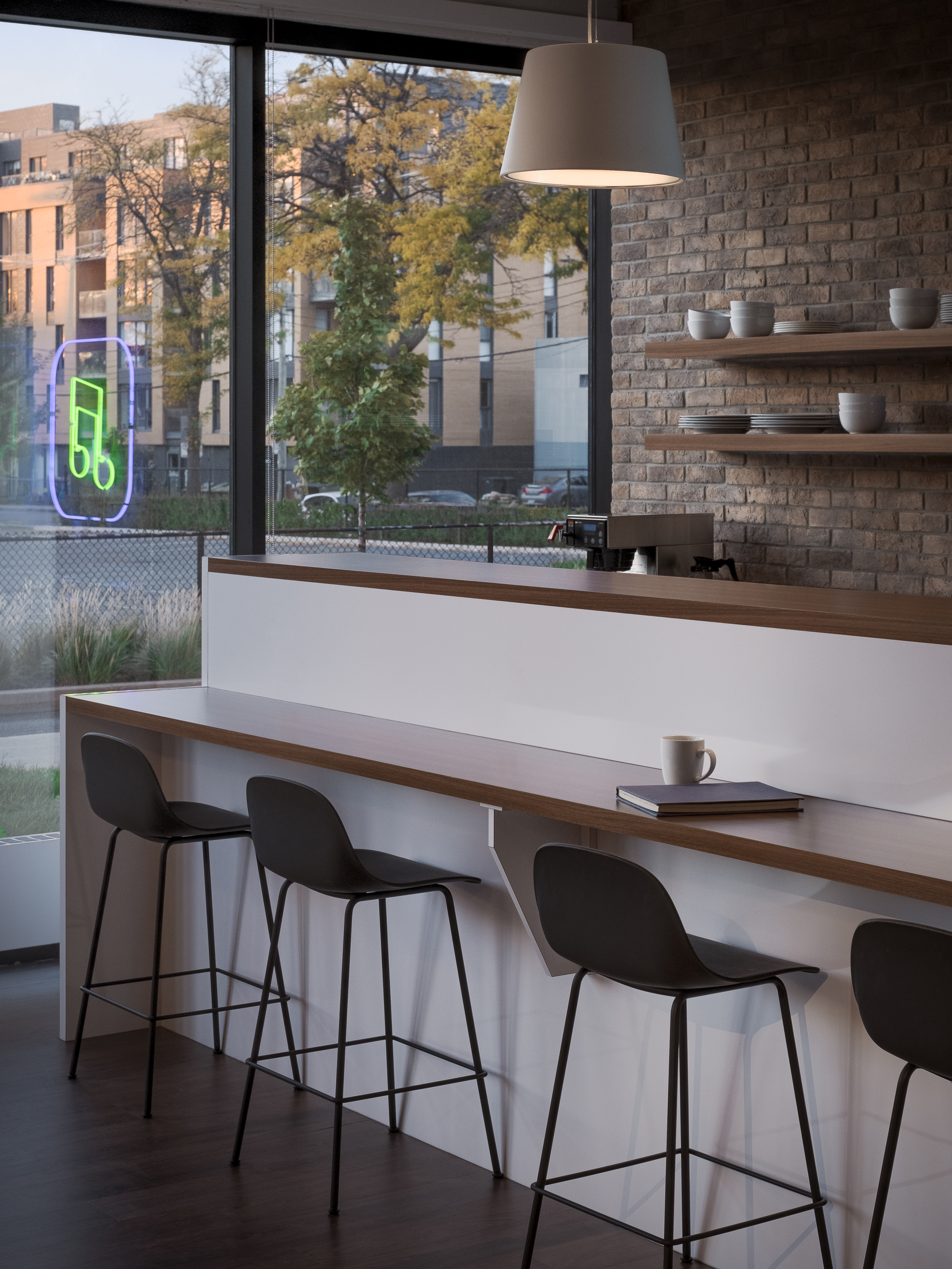
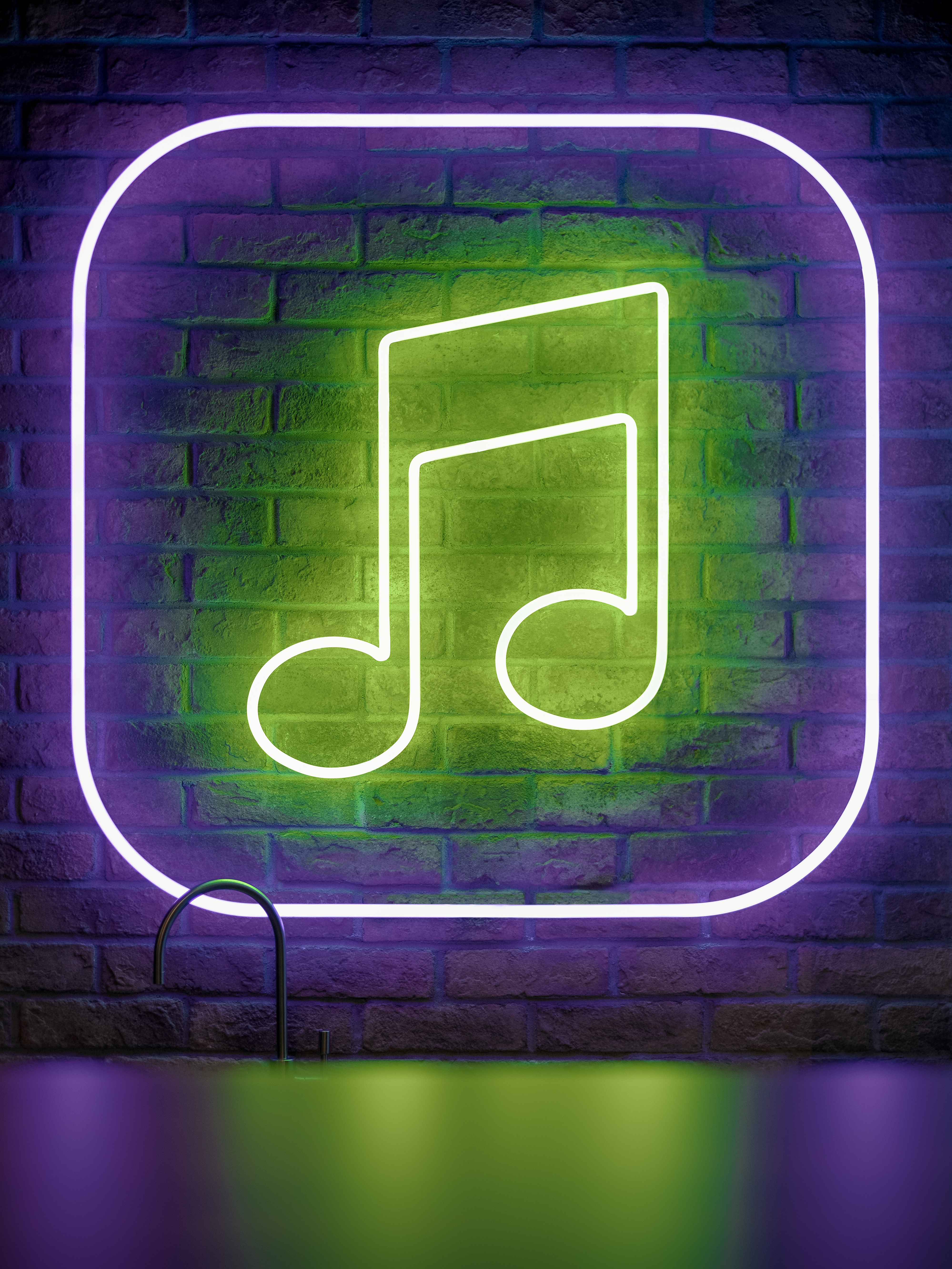
Following the addition of Apple for Business to TouchTunes’s product line, it seemed natural to rethink the overall application of the brand standards in the new space so that they would evoke this product in an energizing and vibrant manner. We decided to utilize the graphic codes of both the jukebox neon and the Apple for Business colour palette (fuchsia, blue and violet) to the entire project. These nods can be seen in the neon sign in the kitchen, or in the matte electric blue paint of the architectural staircase that connects the two floors occupied by the company. They can also be found in the colour palette of the phone booths, in the decals on the lockers at the entrance or even in the finishes of the division wall in the main office area.
- Client
- TouchTunes
- Type of business
- Technology
- Typology
- Corporate
- Project Surface Area
- 7500 sq.ft.
- Global budget
- $1.2 million
- Collaborators
- Burovision
- Location
- Montreal
- Completion Year
- 2020
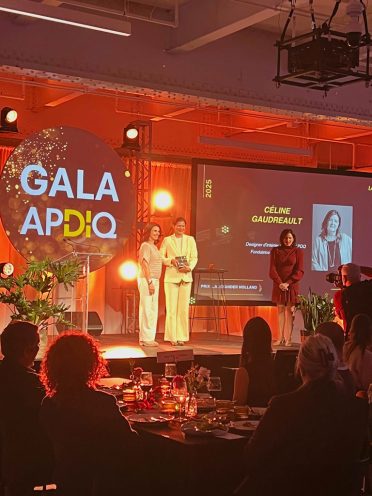
- Award
- Silver Certification - Office of creative firm & company in new technology
Bronze Certified - Interior + Staircase
Silver Certification - Office 5,400 - 54,000 ft2
- Photographer
- Félix Michaud
- Renders By
- Atelier Monarque Architecture
